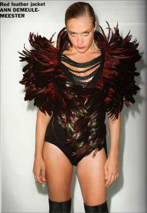


As hard as I try, I can't seem to get over my love for the giant plastic framed shades. Everytime when I think I've found the perfect pair that would last me a lifetime, I find a new pair that is more perfect than the last. And the thing is, they're all basically huge shades with plastic frames!
 So I am perfectly aware that this will probably not be the last time I utter this sentence, but I swear this time I've found the perfect giant plastic shades. Wandering aimlessly around the department store, I glanced over at the shades selection they just popped out from amongst the rows of oddly shaped new trendy shades that I doubt would look flattering on me. It was almost like in those cartoons when the character finally finds the item they've been looking for and the item just shines in the distant and music comes up and the world is perfect again. These Gucci shades are perfectly rounded and the nose support is just right that the bottom of the frames do not touch your cheeks (I have to admit, my current one does touch the cheek). And they look fabulous on. They are just brilliant in its simplicity and elegant shape. It comes in brown and black, but somehow I prefer the brown, thinking its more chic and not quite so dark. Plus, since I already have black plastic frames....brown plastic frames would be a variation.
  My current huge plastic framed shades are from Dior, and don't get me wrong, I still love it to bits. I especially love the Dior "D" on the side with the pretty flower detail on the edges. And it looks great. But I'm sure all of you will agree that they are very different from the Gucci pair......so it is a different kind of perfect. OR maybe the trend for huge plastic frames has evolved over seasons and I have not even noticed but just blindly followed to my liking. Wow, now even I am slightly confused with my logic. Whichever way, those Gucci are just soooo beautiful!
 Incidentally, I would like to mention that I also tried on these pair from DVB, just because its from DVB and I wanted to see what they were like. The shape and design is actually quite nice. Only thing is, they are so black that I felt blind in it. I guess thats what celebs need for maximum coverage from the paparazzi?
Image Source: Otticanet
 See the silk dress on the right -it's amazing how Miuccia managed to combine those peacock-ish colours and still make the dress look pretty and not tacky.
  I LOVE that dress on the right with the fairy print. It's so elegant and feminine with a cute, pretty edge.
 It's so refreshing to see Prada's intellectual, artisitc clothes not looking like it's usual, boxy self. However, I'm not sure how good they'll look on the consumers or who would actually buy crazy coloured pants (like the one on the left.)
 OK, so the first few outfits of underwear are pretty bad, but I do really like his cocktail dresses. (I have a thing for these fake strapless dresses. They're just so much more practical, modest and comfortable than the usual strapless dress, don't you think?)
  I'm not sure how commercial these Japanese-inspired skirts/ dresses will be, but do note the wasit-clinching trend. Ooh, and look at the dress on Du Juan (left,) doesn't it look like flowers are growing on her (and tastefully covering up her private parts?)
  The dress on the left is one of my favourites from this Marni collection. It's artistic without being too over-the-top. And that dress on Lily Donaldson (right) -it actually looks somewhat classic and sleek, something that is not very Marni-like.
 The patent leather bags and skirts are still there, but this time paired with brighter colours.
 Perhaps it's an attempt to try out new silhouettes, but some of the clothes like the dress on the right was so different from Marni's usual clothes that I can't quite appreciate it on the Marni runway yet.


 So I've decided maybe I don't hate those neon-coloured, slogan Tees that much. They're just annoying. Before this collection, I didn't know exactly what to expect. Afterall, he couldn't possibly do endless collections of slogan Tees. And even though I knew I wasn't going to like it, it was more terrible than I expected. The clothes are just so colourful in a trashy way. I know House of Holland is all about being worn to parties, but why would one want to turn up to parties looking like that?
 Louise Goldin is supposedly this runway season's new London designer to lookout for. Since a few of the online reviews seemed to have liked this collection, maybe it's just me who didn't really get the appeal of these clothes so I'm really not too impressed. Maybe it's because I'm too much of a realist and can't imagine wearing these clothes in real life. Oh well, what did you think of this new designer?
 Such a pretty collection! Giles has really improved since he first started. A lot of the dresses from this collection felt very 'fancy tea party' to me.
  The techo, tie-dyed looking silk dresses are so pretty -the blue, the purple, the swirl of colours. And look at the dress in the middle, it looks like a painting of purple clouds (together with the white-ish chiffon underneath.)
 And finally, the artsy dresses. I love how Giles (for the middle dress) combined artsy, cutout pieces with the simple mid-sleeved dress on top. It's a totally wearable simple dress without looking boring!


